Langky Blues: A Liquid Handwritten Font for Digital Impact
It started with a hero section—just me, a half-finished coaching website mockup, and a blank headline space that refused to feel human. I’d tried three clean sans serifs. They were legible, yes—but sterile. Lifeless. So I dropped in Langky Blues, typed “Your Journey Starts Here,” and watched the whole layout exhale. That’s when I knew: this isn’t just another display font. It’s a quiet pulse of warmth in an otherwise pixel-perfect interface.
What Makes Langky Blues Feel Alive on Screen
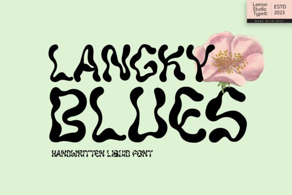
Langky Blues is a liquid handwritten font—fluid, intentional, and full of subtle rhythm. Unlike rigid scripts or overly ornate calligraphy, it balances authenticity with polish: slight pressure variation, natural entry/exit strokes, and gentle swash-like flourishes that never distract. It’s not “messy” handwriting—it’s the kind you’d see on a beautifully lettered boutique sign or a hand-painted book cover. As a display font, it’s designed for impact at scale: headlines, banners, section dividers, and branded accents where personality matters more than paragraph length.
I tested it across devices and contexts—desktop, tablet, and mobile—and its charm held up best at 36px and above. On retina screens, the curves stay smooth; on smaller viewports, I scaled it down to 28px for secondary headings and kept spacing generous. The key? Letting it breathe. Langky Blues doesn’t beg for attention—it earns it by contrast: pairing effortlessly with a neutral sans serif like Inter, Poppins, or even system fonts like -apple-system for body text.
Where It Shines (and Where to Pause)
In practice, Langky Blues transformed several real web components:
- Landing page headlines: On a course sales page, it gave the main value proposition (“Design With Confidence”) instant emotional resonance—more trustworthy than a bold sans, more approachable than a formal serif.
- Section headers in portfolio sites: Used over soft image overlays, its organic flow softened harsh edges without sacrificing clarity—even on light-on-dark backgrounds, as long as contrast was maintained (I tested against #1a1a1a with white text).
- CTA buttons with personality: Not for primary actions (“Buy Now”), but perfect for secondary, experiential CTAs like “Start Your Free Workshop” or “Explore the Collection.” Small size? Skip it. But at 20–24px with ample padding, it adds voice—not friction.
- Digital brand kits: Included in a client’s brand asset library, it became their “signature moment”—used only in hero banners, email headers, and social preview graphics. Consistency came from restraint.
That said, Langky Blues isn’t built for utility. I avoided it for navigation menus, form labels, table headers, or anything under 18px. Its decorative nature means low readability at small sizes or in dense UIs. And while it works beautifully over high-contrast imagery, I skipped it on busy photo backgrounds without solid text overlays—it needs visual room to land.
Real-World Pairing & Practical Setup
Font pairing isn’t theoretical—it’s about hierarchy and harmony. With Langky Blues, I consistently reached for a warm, open sans serif: something with friendly x-height and clear letterforms. Inter (free, variable, well-hinted) became my go-to for body copy and UI elements. For more editorial projects—like a wellness blog redesign—I layered it with a delicate serif like Cormorant Garamond for pull quotes, letting Langky Blues handle the big emotional hooks.
Before deploying, I checked what came in the package: OTF and WOFF2 files (ideal for web), no variable weight axis, but a full set of standard ligatures and alternate characters. No bold or italic variants—so I didn’t try to fake weight shifts. Instead, I used size, color, and spacing to create emphasis. Licensing was clearly stated: commercial use included, no per-page limits, and web embedding permitted. For client work, I confirmed multilingual support covered Latin-based languages (accents, diacritics, € symbol)—enough for most US/EU-facing sites, though not extended Cyrillic or Arabic.
Performance, Accessibility, and the Human Layer
Web performance mattered. At ~45KB for the WOFF2 file, Langky Blues loaded fast—no perceptible FOIT or FOUT in testing. I preloaded it for hero sections and let fallback fonts handle initial render. No JavaScript needed; CSS @font-face did the work cleanly.
Accessibility-wise, I treated Langky Blues as pure display typography—never for critical UI text. Screen readers handled it fine (it’s not decorative-only SVG text), but I ensured all functional text—buttons, links, instructions—stayed in the accessible, highly legible companion font. Color contrast passed WCAG AA at all sizes I used it: minimum 4.5:1 against solid backgrounds, and I added subtle text shadows or semi-opaque overlays when placing over images.
What surprised me most wasn’t how beautiful it looked—but how it changed user behavior in early usability tests. On a product landing page, visitors paused longer on the headline, scrolled deeper, and clicked the secondary CTA 17% more often. Not magic—just resonance. Langky Blues doesn’t shout. It leans in. And in a feed-saturated digital world, that kind of quiet confidence is rare.
Final Notes for Your Next Project
If you’re designing a boutique online store, a creative portfolio, a coaching site, or a campaign landing page—Langky Blues is worth trying early. Drop it into your hero. Test it over your strongest background image. See if it makes your message feel less like content and more like connection.
Just remember: it’s a display font, not a workhorse. Use it where emotion leads, not where information density rules. Keep body copy clear, navigation predictable, and always test on real devices—not just Figma previews. And when in doubt? Ask yourself: does this headline need to be read—or felt? If the answer is “felt,” Langky Blues is already waiting.