Skyters Skreat: A Bold Display Font for Digital Branding
As a web designer who ships landing pages, SaaS dashboards, and e-commerce experiences daily, I pay close attention to how typography shapes perception before a single word is read. Skyters Skreat isn’t just another display font—it’s a deliberate visual cue that signals confidence, creativity, and clarity in digital spaces where first impressions decide bounce rates and conversions.
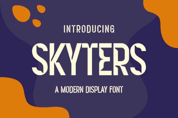
Skyters Skreat stands out with its high-contrast letterforms, sharp terminals, and confident x-height. It’s geometric but not sterile—there’s rhythm in its spacing and intention in its weight distribution. Unlike overly ornate display fonts that sacrifice legibility at scale, Skyters balances expressive character with structural integrity. That makes it unusually versatile across screen sizes and contexts—from a 48px hero headline on desktop to a tightly cropped mobile banner or a subtle logo lockup in a navigation bar.
Where Skyters Delivers Real Web Design Value
In practice, Skyters excels where hierarchy and tone matter most:
- Hero sections: Paired with a clean sans serif like Inter or Manrope, Skyters instantly establishes brand voice—ideal for creative studios, boutique brands, or coaching platforms aiming for approachable authority.
- Landing page CTAs: Use Skyters for short, action-driven phrases (“Start Free Trial”, “Join the Waitlist”)—not full buttons, but headline-level emphasis above the fold. Its bold presence guides scanning behavior without competing with functional UI elements.
- Online store banners: On Shopify or WooCommerce product pages, Skyters adds editorial polish to seasonal promotions or limited-edition drops—especially effective over high-contrast image overlays when tracked and spaced thoughtfully.
- Course and membership sites: For digital education brands, Skyters lends distinction to module titles or course names while keeping supporting copy in a neutral, highly readable typeface.
- Portfolio and agency websites: It works beautifully as a signature typographic element—used sparingly in logos, project headers, or section dividers—to reinforce a cohesive, ownable identity across devices.
Readability & Responsiveness: Practical Considerations
Skyters is designed for impact—not body text. Never use it below 24px on desktop or 20px on mobile. On smaller screens, test line height (1.2–1.3 works well) and letter spacing (+20–40 units in CSS) to prevent crowding. It performs reliably on both light and dark backgrounds, though avoid placing it directly over busy imagery without a subtle background tint or drop shadow for contrast.
For responsive layouts, reserve Skyters for headings only—never for navigation links, form labels, or paragraph text. Its personality shines strongest when contrasted with restrained supporting typography: pair it with a neutral sans serif (e.g., Inter, Poppins, or Work Sans) for UI components and body content. If your brand leans editorial—think newsletters, blogs, or knowledge bases—a crisp serif like Crimson Pro or Literata complements Skyters’ geometry without clashing.
Licensing, Formats & Integration
Skyters Skreat ships as a premium font with full OpenType features, including stylistic alternates and multilingual support (Latin Extended-A). Webfont files are available in WOFF2 format—the most widely supported and performant option for modern browsers. When embedding via CSS @font-face, always host locally or use a trusted CDN to ensure consistent loading and avoid render delays.
Licensing is straightforward: a standard commercial license covers use across client websites, SaaS products, online stores, digital templates, and brand assets—including static exports for social media graphics and email headers. Just confirm the license includes web embedding rights—some display fonts restrict usage to print or mockups only.
When to Reach for Skyters (and When Not To)
Skyters earns its place when you need to:
- Anchor a brand’s visual identity with a memorable, ownable typographic signature;
- Elevate short-form messaging in high-visibility areas—headers, banners, logos, or feature cards;
- Signal creative energy without sacrificing professionalism (unlike script or handwritten fonts that can feel too casual for B2B or service-based brands);
- Support fast-scanning behavior by making key sections instantly distinguishable through typographic contrast.
Avoid using Skyters for:
- Paragraph text, captions, or data tables—its decorative nature hinders sustained reading;
- Small UI elements like button labels or filter tags—legibility degrades below 16px;
- Long headlines with more than 5–6 words—tight kerning and strong character shapes work best with brevity;
- Brands prioritizing minimalism or corporate neutrality—Skyters communicates intention, not invisibility.
Final Pairing Tip for Real Projects
Try this combination on your next landing page: Skyters Skreat for the H1 and section headers, Inter Variable for all body text and interface elements, and a single accent color applied only to hover states and primary CTAs. That trio delivers clarity, hierarchy, and brand cohesion—without over-engineering. You’ll notice users pause longer on headlines, scan more deliberately, and associate the visual rhythm with your brand’s confidence—not just its message.
Skyters doesn’t replace thoughtful information architecture or user-centered design. But in the right context—paired intentionally, sized responsively, and licensed correctly—it becomes a quiet multiplier: reinforcing trust, guiding attention, and making digital experiences feel unmistakably yours.